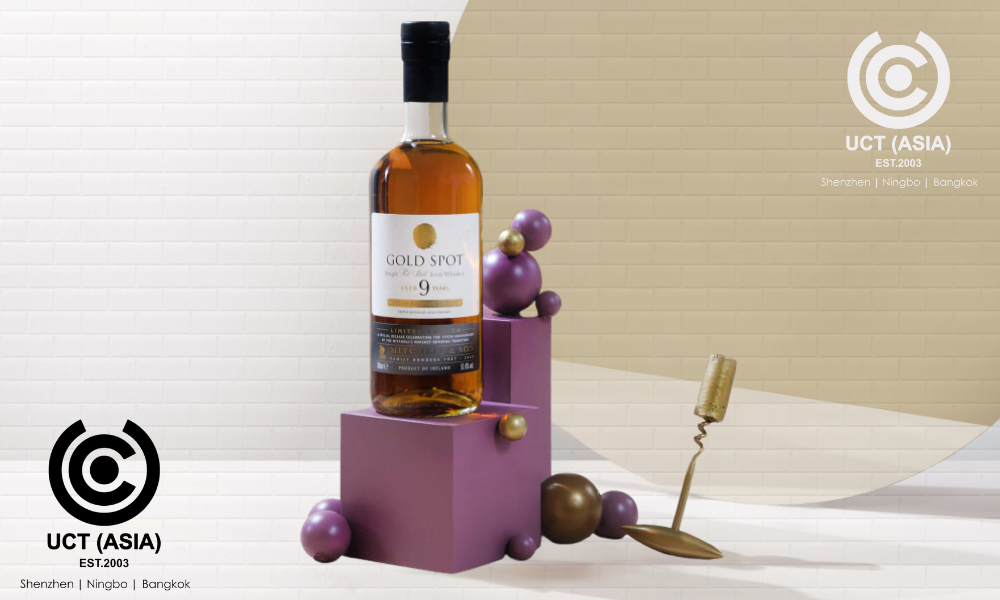
As regards brand development, the importance of design can not be overemphasized. Your design acts as the silent ambassador of your brand, expressing its essence and values without using words.
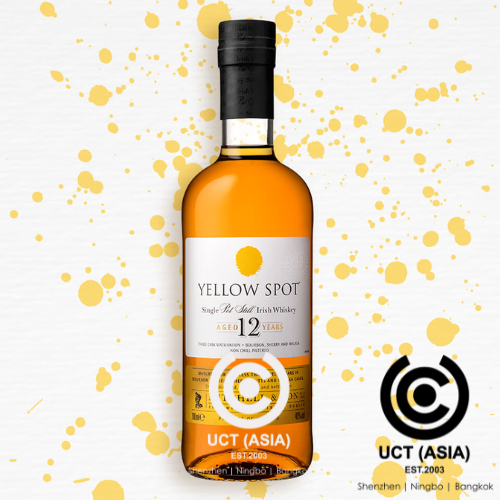
When it comes to liquor packaging, the Yellow Spot liquor is a perfect example that highlights the importance of design in building a brand.
First Impressions Matter
The Yellow Spot Liquor packaging is an example of how important a first impression is. The bright yellow colour, which was purposefully chosen for its attractiveness and brightness, draws attention to itself right away on the shelf. The initial visual encounter plays a crucial role in establishing a connection with the consumer and sparking interest.
Reflecting Brand Identity
A well-designed packaging is an extension of a brand’s identity. In the case of Yellow Spot, the packaging resonates with the brand’s values and character. The intricate details, the choice of fonts, and the overall aesthetics align seamlessly with the essence of the liquor. In addition to serving as a container, the packaging also serves as a visual representation of the brand’s identity.
Evoking Emotions
Design has the power to stir up emotions, and Yellow Spot does so by tapping into the sentiments associated with luxury. The sleek packaging triggers a sense of exclusivity, enhancing the perceived value of the product. Emotions play a big role in consumer decision-making, and well-designed products can arouse the right emotions in people.

Consistency Across Platforms
A successful brand maintains consistency across multiple touchpoints. The Yellow Spot Liquor packaging design seamlessly integrates with the brand’s broader visual identity, ensuring a cohesive experience. Whether it’s the label on the bottle or promotional materials, a unified design language reinforces brand recall and builds trust among consumers.
Standing Out in a Crowded Market
In a market saturated with liquor options, standing out is imperative. The Yellow Spot Liquor distinguishes itself through its design, creating a unique visual identity. The bold colour choice, coupled with distinctive patterns and graphics, sets it apart from competitors, making it easily recognizable in a crowded shelf space.
Adaptability and Timelessness
Good design is not just about what’s visually appealing today; it’s about longevity. The Yellow Spot liquor packaging has a timeless quality that transcends fleeting design trends. This adaptability ensures that the brand remains relevant and appealing to consumers over the years, which continues its sustained success in the market.
In conclusion,
The packaging for Yellow Spot Liquor is an example of how important effective design is to brand development. The design influences the consumer’s perception in many ways, from making an appealing first impression to arousing emotion. Investing in strategic and thoughtful design becomes essential for brands navigating the competitive market to establish a strong and enduring presence in the market.
Harness Our Creativity!
We’ve seen the transformative power of a good design in brand development through the lens of Yellow Spot Liquor packaging. You, too, can harness this creative level to develop your brand.

