
Online shopping has shifted from convenience to expectation. Your merchandise website now acts as your brand’s primary storefront, often becoming the first and most critical interaction point with potential customers. Google research shows that users form an opinion about a website in under 50 milliseconds. That single moment determines whether they explore further or leave.
Success doesn’t come from visual appeal alone. A high-performing merchandise website aligns design, functionality, and psychology to guide users from curiosity to purchase. Each step of the journey must reduce friction and reinforce trust.
1. Define a Brand Identity That Guides Every Decision
Before selecting tools or designing pages, establish clarity around your brand. Without it, your website becomes visually inconsistent and emotionally disconnected.
Ask yourself:
- Who are you targeting?
- What feeling should your brand evoke?
- What makes your merchandise different?
A consistent identity across colors, typography, and imagery builds recognition. Over time, this recognition reduces decision-making effort for customers. When users instantly recognize your brand, they move faster through the buying process.
2. Choose an E-commerce Platform That Scales With You
The platform you select shapes everything from performance to user experience. Instead of chasing trends, evaluate platforms based on long-term usability.
Focus on:
- Scalability → Can it handle growth in traffic and products?
- Payment flexibility → Does it support multiple payment methods?
- Mobile optimization → Is the experience seamless across devices?
- SEO capabilities → Can your products rank in search results?
A poor platform creates friction behind the scenes. A strong one removes barriers before customers even notice them.
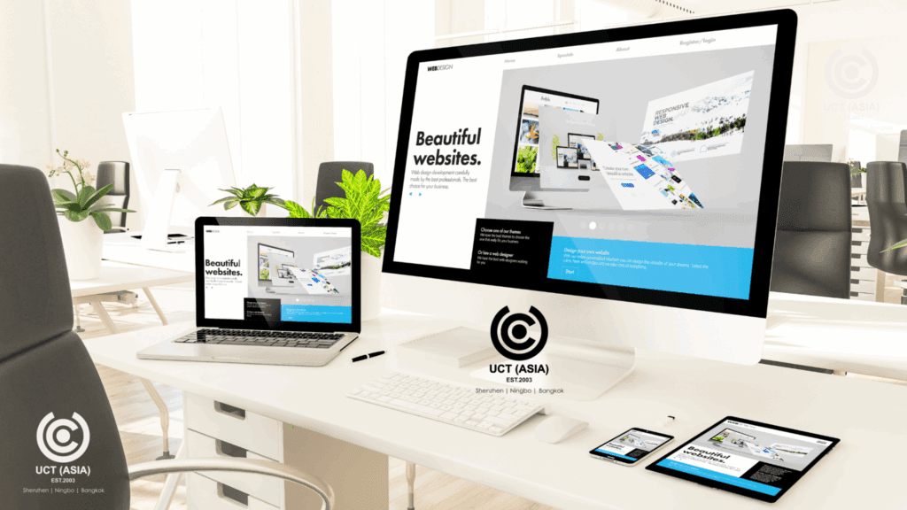
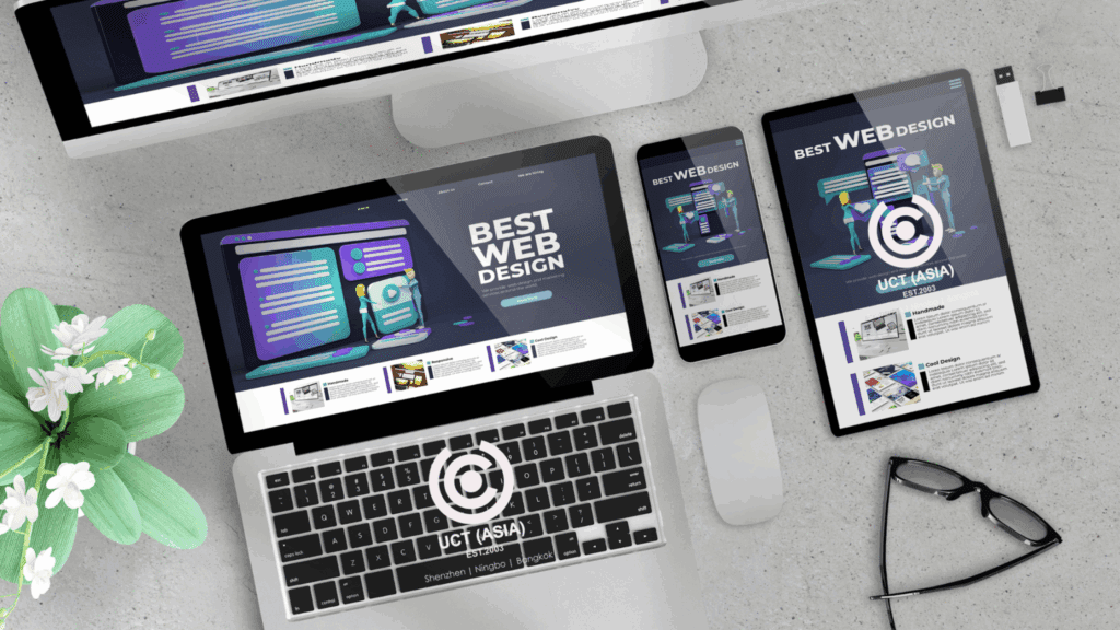
3. Design for How People Actually Browse
Users don’t read websites linearly. They scan, scroll, and make rapid judgments. A cluttered or confusing layout increases cognitive load, which leads to drop-offs.
Research shows that over one-third of users stop engaging with a website if the layout feels unattractive or difficult to navigate.
Structure your design around clarity:
- Use high-resolution product images from multiple angles
- Organize products into intuitive categories
- Maintain consistent spacing and visual hierarchy
When navigation feels effortless, users stay longer and explore more products.
4. Optimize for Mobile First, Not Mobile Later
Statista reports that more than 60 percent of ecommerce traffic comes from mobile devices. Yet many websites still treat mobile as a secondary experience.
Mobile optimization goes beyond resizing content. It involves:
- Thumb-friendly navigation
- Fast-loading pages
- Simplified menus
- Clear call-to-action buttons
If users struggle to browse or purchase on mobile, they leave quickly. A smooth mobile experience directly increases conversions.
5. Speed Determines Whether Users Stay or Leave
Page speed influences both user experience and search rankings. Even a one-second delay can reduce conversions by up to 7 percent.
To improve speed:
- Compress images without sacrificing quality
- Use efficient hosting and caching systems
- Minimize unnecessary scripts
Fast websites feel reliable. Slow ones create doubt, even if the products are excellent.
6. Build Trust Before Asking for a Purchase
Visitors rarely buy from a website they don’t trust. Trust must be established early and reinforced throughout the journey.
Effective trust signals include:
- Customer reviews and ratings
- Secure checkout badges
- Clear return and refund policies
- Visible contact information or live chat
Social proof plays a major role here. When customers see others validating your products, perceived risk decreases significantly.
7. Reduce Friction at Every Step of the Journey
Every extra step, click, or confusion point increases the chance of abandonment. Baymard Institute data shows that nearly 70 percent of carts are abandoned, often due to unnecessary complexity.
Focus on removing friction:
- Keep navigation simple
- Avoid overwhelming users with too many choices
- Use clear and direct calls to action
The easier it is to move forward, the more likely users are to complete their purchase.
8. Create a Checkout Experience That Feels Effortless
Checkout is where many websites lose customers. A complicated process interrupts momentum and introduces hesitation.
Simplify the process by:
- Offering guest checkout options
- Supporting multiple payment methods
- Using progress indicators
- Reducing form fields to essentials only
When checkout feels quick and intuitive, users follow through without second-guessing.
9. Use Data to Continuously Improve Performance
A successful merchandise website evolves. What works today may underperform tomorrow.
Track key metrics:
- Conversion rate
- Bounce rate
- Cart abandonment rate
- Average session duration
Use this data to test and refine elements such as layouts, product pages, and checkout flows. Small improvements often lead to significant gains over time.
10. Align Design, Trust, and Function Into One Experience
High-performing websites don’t rely on isolated improvements. They combine multiple elements into a seamless system.
When:
- Design attracts attention
- Navigation keeps users engaged
- Trust elements reduce hesitation
- Checkout removes friction
The result is a smooth journey from first click to completed purchase.
Build a Website That Works as Hard as Your Brand
A merchandise website should do more than display products. It should guide, reassure, and convert. Every detail, from loading speed to checkout flow, influences how users perceive your brand and whether they decide to buy.
If you want to create a website that not only looks polished but also performs consistently, working with experts in branded merchandise solutions allows you to build a platform that aligns design, functionality, and strategy into a system that drives real business results.