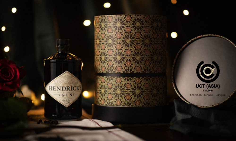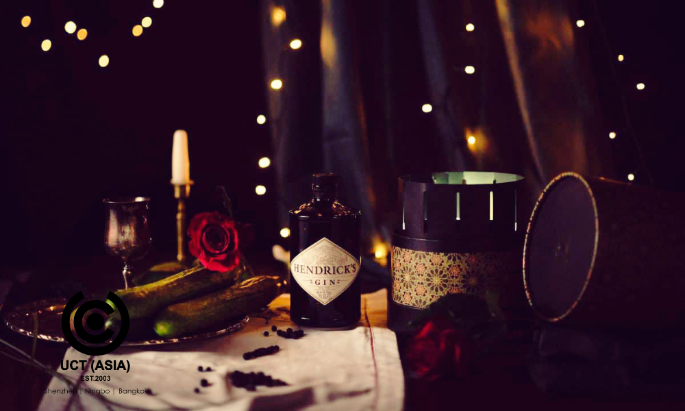
Here is another dignifying brand collaboration, and what do they say about what two heads can do? Truly two heads are better than one and we can say that again for Hendrick’s Gin’s collaboration with Designer Annie Atkins!
Having a perfect design for your brand can be the only force you need to propel customers to empty their bank accounts. A beautiful design is a powerful tool to mend the heart of buyers, even those who are uncertain about buying. People tend to conclude about things by merely seeing the exterior and that is why we are most intrigued about this scintillating collaboration.
Over the years, Annie Atkin has collaborated with reputable brands like Wes Anderson and the result was a blockbuster of an alliance. Hendricks’ collaboration with Annie Atkin has left curiosity in the eyes of all beholders.
How Hendrick’s Gin Collaboration With Annie Atkin Mesmerizes Customers!

The attributes of this collaboration can not be overemphasized; however, below is a list of some distinctive features of this marketing campaign that makes it mesmerizing;
1. Powerful Design and Aesthetic Art
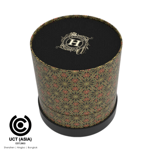
“I thought about a box turning into something fun and how it could relate to the Victoriana style of Hendrick’s and its lovely use of steampunk meets unusually futuristic but old-fashioned motifs. When I thought of the zoetrope, everything clicked into place,” these were the words of Annie Atkin during one of the interview sections with her.
The exterior look of a product and packaging is as good as the content in there. With so many products crowded in the supermarkets and grocery shelves, it is paramount that you create a design that stands out from the crowd of competitors. A design that portrays an instant purchase!
2. Satisfactory Customers Experience
From the fine bottle of Hendricks Gin sheathed in the coolest of flowery colours and cucumber printed-like boxes down to the Victorian-inspired hand-drawn animation, this Zoetrope is surely an embodiment of satisfaction and simplicity.
Customers are always bewildered and happy when they see that their clients go the extra mile for them. They feel happy and indeed, you can see this from their wonderful reviews and testimonials.

3. Promotion of Sales
Bumped into the supermarket to get some gin to make for the night. Unfortunately, there are no precise gins in mind and the gins available are so many on the shelves that you could not get a hang of them all. Suddenly, you sighted an eye-catching well packaged and branded gin and here you go, hijacking it from the shelf among others and boom, you paid for it and left.
This is a perfect scenario of what happens daily in supermarkets and grocery stores. However, what can you deduce from the aforementioned scenario? Why the eye-catching gin and not the others? Obviously, it is not that other gins were not branded too!– that is the power of a synchronous collaboration and a perfect design.
A perfect design puts you on heads up. It boosts your sales, value, image and everything in between.
In Conclusion
You do not have to copy or mimic others but you should learn and refine the lessons learnt in your unique way. Go the extra mile! Sow in the most engaging collaboration then sit and watch your brand reap bountifully in the most spectacular way.
Let’s Help You at UCT (ASIA)!
A multifaceted brand and more with a burning interest and eternal passion to help brands, especially new startups, build their business while helping existing brands expand their expertise.
From your promotional and sleek designs, POS displays, and marketing ideas down to the In-store gift packs, customization and branding, we are ready to help you out.
Contact us today at UCT (ASIA)!

