Pop-ups are temporary stores that serve important strategic marketing functions like helping brands increase sales and build awareness.
In the past, pop-ups used to be small outposts of existing in-store brands. However, they’ve evolved in recent times into valuable, often bold standalone temporary stores for retail businesses. It would be rare to walk through global airport hubs without seeing a pop-up of some type.
In this article, we’ll discuss Hendrick’s creative Pop-up in Amsterdam and the top 3 reasons travelers are attracted to it.
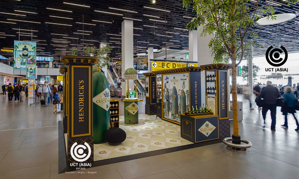
Hendrick’s Pop-up at Amsterdam Schiphol Airport
When a pop-up combines fun and creative elements to catch the eye of curious shoppers, then it has passed the test of effectiveness. This is the story of Hendricks pop-up at the Amsterdam Schiphol Airport where our team encountered it.
The pop-up was centered around turning heads and giving customers a unique experience while they wait for their flights.
What are the Top 3 Reasons Travelers are Attracted to it?

Unique and Engaging Design
The first thing you’ll notice about any pop-up is its design. How different is it from others within its environs? What are the features that make it different?
Hendricks excellently passed this eye test. The design was eye-catching, unconventional, and replete with playful elements.
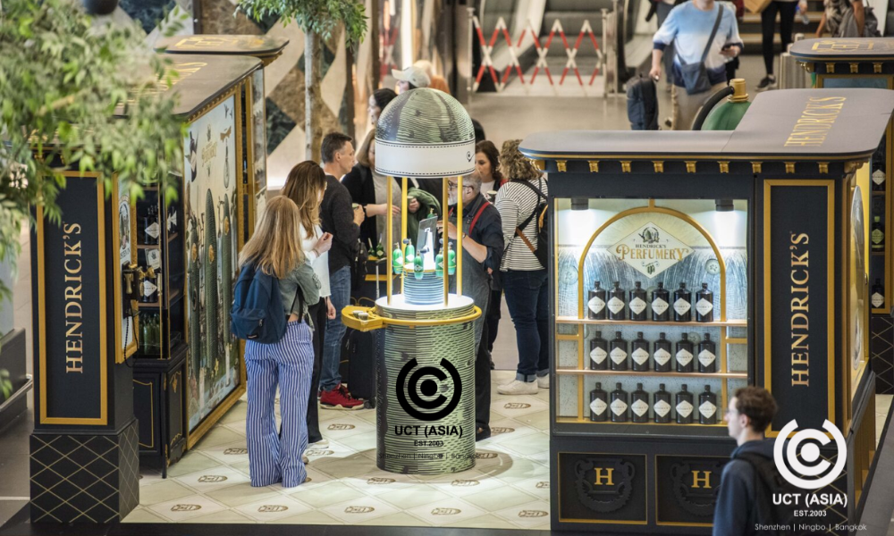
But the looks of the pop-up weren’t all there was. The design also had engaging features. Shoppers could partake in the taste-sampling experience, join the fun activities, and even learn about the gin-making process.
Convenient Location and Accessibility
An important aspect of every effective pop-up is its location and how easily accessible it is to shoppers. Hendricks pop-up also excelled at this. It was strategically placed to make accessing it easier for shoppers. The prime location of the pop-up meant that arriving, waiting, and leaving travelers could easily see and check out the pop-up.
Victorian-Inspired Shop Window
Unique to this pop-up is the inclusion of a Victorian-Inspired Shop Window. Through this window, Hendrick showcased its exceptional gin products such as Hendrick’s Original and Hendrick’s Amazonia. This concept added a touch of nostalgia and charm, drawing in customers who are familiar with the famous concept from the Victorian era.
Conclusion
Hendricks’s pop-up creatively combines these three main reasons to come up with this eye-catching pop-up. To aid the pop-up’s aim of advancing the Hendricks’ cause, the brand also ensured the atmosphere was relaxing and generally playful to give customers an unforgettable experience.
Take Action Now!
Hendricks’s case is a perfect example of how to create attractive pop-ups. And speaking of creating attractive pop-ups, is there a better to have it done than now?
And who does it better than UCT (Asia)? If you want to install creative, fun, and eye-catching pop-ups that tell your brand story, UCT (Asia) is your go-to brand! Our team of expert designers is always ready to work with you to create engaging and captivating displays, pop-ups, and marketing strategies.
You say the word and we make it happen. Contact us today to get started!

