What better way is there to promote your spirit and beverage brand than to offer something different to the customers? By ‘different’, we’re not necessarily talking about the products you dish out. Offering something different, in this context, could mean offering fresh ideas that are a delight to the eyes.
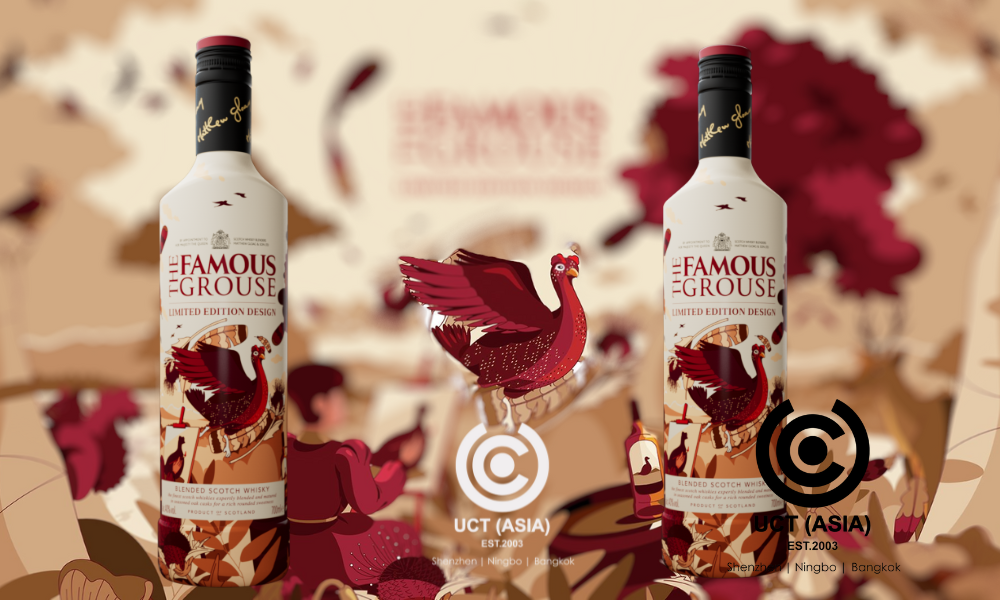
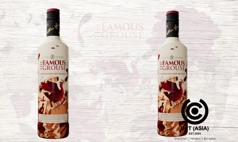
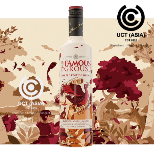
For example, one powerful move you can make is ensuring your product packaging is unique! And talking about creative product packaging, let’s take a look at Nuria Boj’s stunning design for The Famous Grouse bottle.
Before we talk about the intricacies of the design, let’s get to know The Famous Grouse. This iconic Scotch whisky has been gracing glasses and gatherings since its inception. Known for its smooth taste and rich heritage, The Famous Grouse has become a big player in the spirits industry.
Now, to the design. Imagine a bottle that holds your favourite whisky and also serves as a work of art on your shelf. Nuria Boj’s design for The Famous Grouse bottle is just that. With its sleek lines and elegant curves, this bottle stands out among its peers on the shelf, beckoning customers to pick it up and take a closer look.

But what exactly makes this design unforgettable? Let’s break it down into five factors:
● Minimalistic Elegance
Boj’s design embraces the concept of “less is more.” Instead of overwhelming the viewer with intricate details, she opts for simplicity. The bottle features clean lines and a minimalist colour palette, allowing the whisky inside to take centre stage. This understated elegance makes a powerful statement on any bar cart or display shelf.
● Subtle Branding
While it’s important for a product to showcase its brand, too much branding can detract from the overall aesthetic. Boj strikes the perfect balance with The Famous Grouse bottle design. The brand logo is displayed prominently but tastefully, ensuring that it complements rather than overpowers the rest of the design. This subtlety adds a touch of sophistication to the bottle’s appearance.
● Distinctive Shape
With the retail store filled with generic bottle shapes, Boj’s design stands out with its unique silhouette. The bottle’s curvy form not only catches the eye but also feels comfortable to hold. This distinctive shape sets the scotch whiskey brand apart from its competitors and enhances the overall drinking experience for consumers.

● Attention to Detail
Despite its minimalist approach, Boj’s design doesn’t skimp on the details. From the precisely crafted cap to the subtle embossing on the glass, every element of the bottle exudes quality and craftsmanship. These thoughtful details may go unnoticed at first glance but add to the overall sense of luxury and refinement.
● Timeless Appeal
While trends come and go, Boj’s design for The Famous Grouse bottle possesses a timeless quality that transcends temporary trends. Its classic elegance ensures that it will remain relevant and captivating for years to come, making it a worthy addition to any whisky lover’s collection.
Work With UCT (ASIA)!
Take your brand’s packaging to the next level with UCT (ASIA)! Let our experienced designers create stunning and unforgettable packaging solutions that will set your products apart on the shelf. Contact us today to learn how we can bring your ideas to life.

