As far as marketing is concerned, whether you’re in the spirits and beverage industry, or the clothing industry, the packaging of your product is important. It serves as the first point of contact between your products and potential customers. Therefore, your packaging should be designed in a way that attracts these customers in the most eye-catching manner.
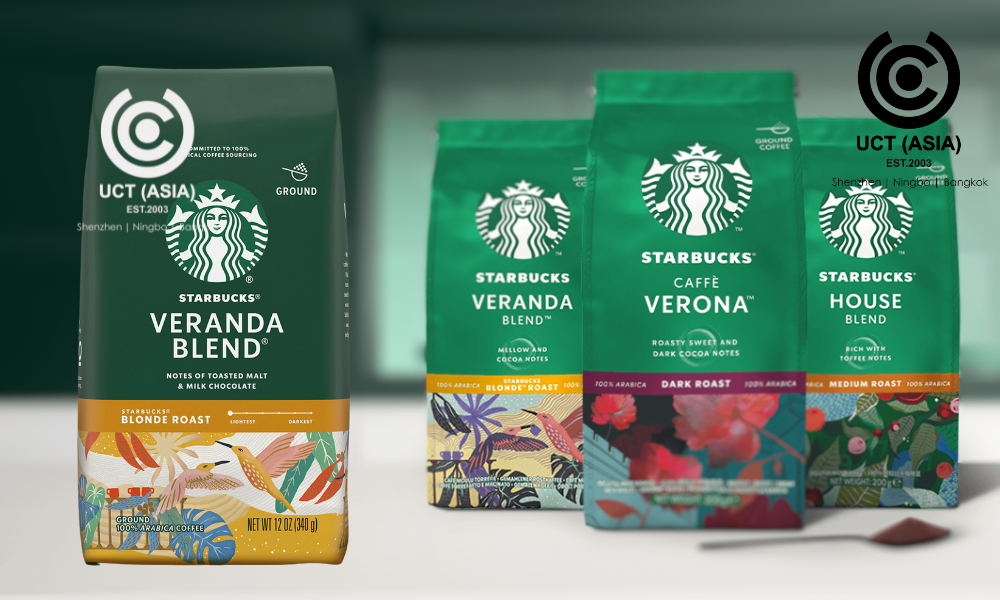
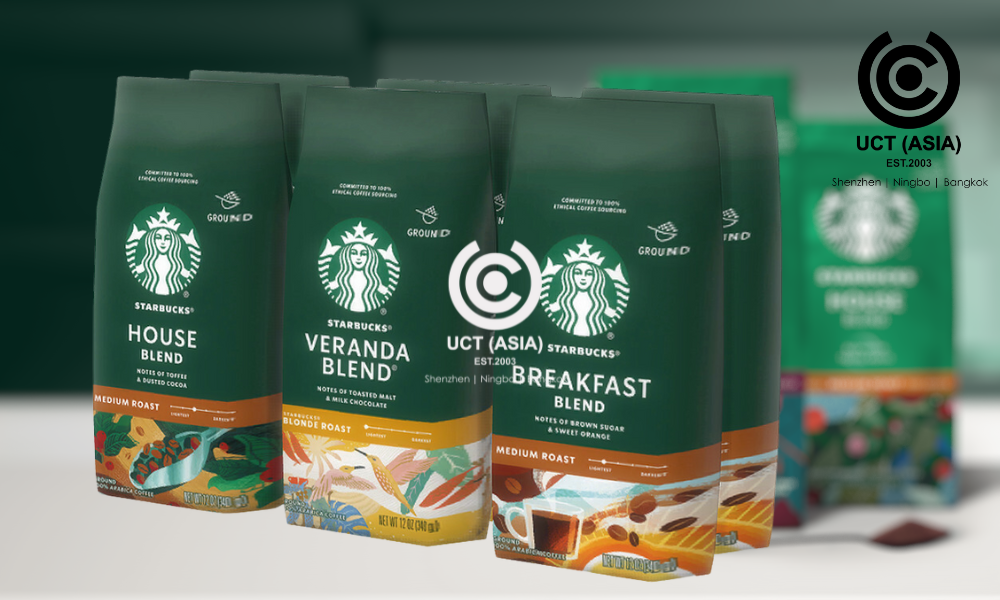
Recently, our attention was caught by an example of what a product packaging should look like. And it’s the packaging of Starbucks’ new best-selling coffee.
As a leading coffeehouse giant, Starbucks needs no introduction. Renowned for its commitment to quality and innovation, the brand has captured millions of hearts worldwide, not just for its products, but also for its excellent range of packaging.
5 Amazing Things We Love About This Packaging

So, what exactly sets this packaging apart from the rest? Let’s find out as we explore the 4 things we love about this packaging.
1. Eye-Catching Design
Who says packaging has to be boring? Starbucks’s new design is a feast for the eyes, featuring engaging Starbucks artwork, and vibrant colours that warmth and comfort, and when you look closer, you’ll notice the smaller details, fracturing odes to the coffee’s origin – all working together to create a cohesive and visually appealing packaging that demands attention on the shelves.
2. Freshness Lock
Another element of this packaging we love is what we’d like to call the “freshness lock”. This feature seals in the flavour and aroma of your coffee, keeping it fresh for longer. So, every time you open the bag, it’s like opening a fresh pack of coffee beans or grounds, ensuring that each cup tastes as delicious as the first one.
This feature ensures customer satisfaction as it delivers a constantly premium coffee experience and aligns with environmentally conscious values.
3. Commitment To Sustainability
We all know the importance of being eco-friendly, and Starbucks is leading the charge with its commitment to sustainability. The new packaging is made from 100% recycled materials, reducing waste and minimising environmental impact without compromising on quality.
4. Inclusion of QR Code
Starbucks new packaging features a QR code that provides a seamless way for customers to access detailed information about Starbucks sustainable and ethical sourcing practices. It also provides information about the coffee grounds, including its origin, roast level, and flavour profile.
This transparency builds trust and confidence in the product and empowers consumers to make informed choices that align with their preferences.
Final Thoughts
So there you have it, – four game-changing features that make Starbucks’s new best-selling coffee packaging a force to be reckoned with in the UK coffee market. With its freshness lock, eye-catching design, sustainability efforts, and QR code feature, it’s no wonder this packaging is flying quickly off the shelves.
Why Settle for Anything Less? Partner With UCT (ASIA)!
Upgrade your packaging game today and experience the difference for yourself! Let UCT (ASIA) help you create attention-drawing packaging that meets the world’s standards. We work with the best product designers in Asia to ensure we give you nothing short of the best. Contact us today to get started!

