A growing increase in air travelers over the years has made airport shopping more popular. There’s a growing rise in the number of air travelers around the world who enjoy buying items at airports. This has opened a great opportunity for brands to connect effectively with traveling shoppers and push their names to the forefront.
Thus, proper planning and execution of excellent marketing strategies are required to elevate their brand and enhance communication with their customers. This is where retail POS displays come in!
Retail POS displays are excellent marketing tools that can take your brand to the next level. Customising them to fit your marketing campaign makes them even more powerful.
Milka’s Retail POS Display

As it is our custom, we’re constantly looking around retail stores for captivating marketing ideas and outstanding promotions. Milka presents us with a great example!
Milka is a Swiss chocolate brand established in 1901. With the introduction of the brand’s trademark colour, Lilac, conveying luxury, and the brand’s mascot, Lila, it is clear that Milka is no pushover in the marketing game.
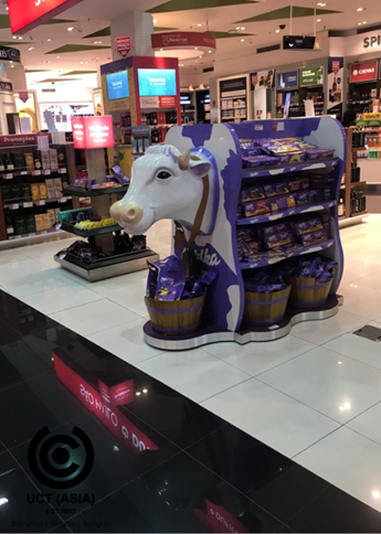
We spotted this striking display at an airport in the United Arab Emirates and we absolutely loved it.
So without further ado, here are 3 reasons why we love this promotion.
1. 3-in-one Combo
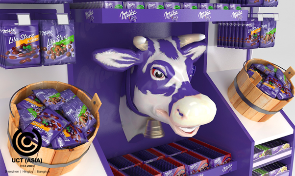
We love the excellent idea to combine 3 marketing tools in this display. The shelf display is a great way to promote your products, but it can also act as an invitation for shoppers to take a look at your products. The brand used this tool effectively.
The second tool utilized by Milka is the buckets strategically kept so that customers can easily collect the free chocolate bars. With this, the barnyard design was achieved.
Finally, Milka’s promotional gift — Lila’s pouch completes the magical three. The gift, coupled with the delightful experience of the chocolate bars makes the display a remarkable one.

2. Perfectly Features Milka’s Brand Identity
A brand’s identity is its physical elements, including color, logo, design, and symbol. These elements help customers to identify the brand.
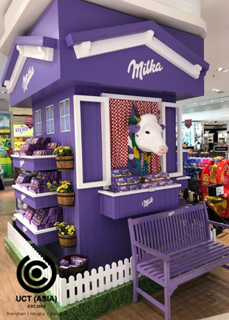
Being one of the most successful chocolate brands, Milka definitely has its brand identity. This includes Lila, the purple cow with a bell around her neck which is the symbol of the brand, the trademark purple colour, and the logo of the brand.
We love how Milka featured all these elements in their POS display. Shoppers can easily identify the brand’s display even from a distance.
3. Shoppers’ Easy Access To Products
Customers enjoy being able to access and examine a product before deciding to buy or not. The easier access they have to the products, the more likely they’re to buy.
This POS display makes it easy for shoppers to access the premium promotional product on offer. It is a good way of enticing shoppers into making a favorable purchasing decision.
In Conclusion,
Milka showed mastery of the marketing game with this remarkable retail display and branded promotional pouch. This is a perfect model to copy for your next promotional campaign.
Are you ready to take your brand to the next level with an amazing display and promotional gift? Not sure where exactly to begin? Relax, let UCT (ASIA) help you!
We can help take your brand to the next level with our exceptional marketing campaign strategies. We specialise in the production and design of promotional products, in-store displays, on-packs gifts, and many others.
Send us an inquiry today to begin!

