With the competition in the liquor industry increasing rapidly, can bottle designs really convince consumers to buy your product?
The answer? Yes!
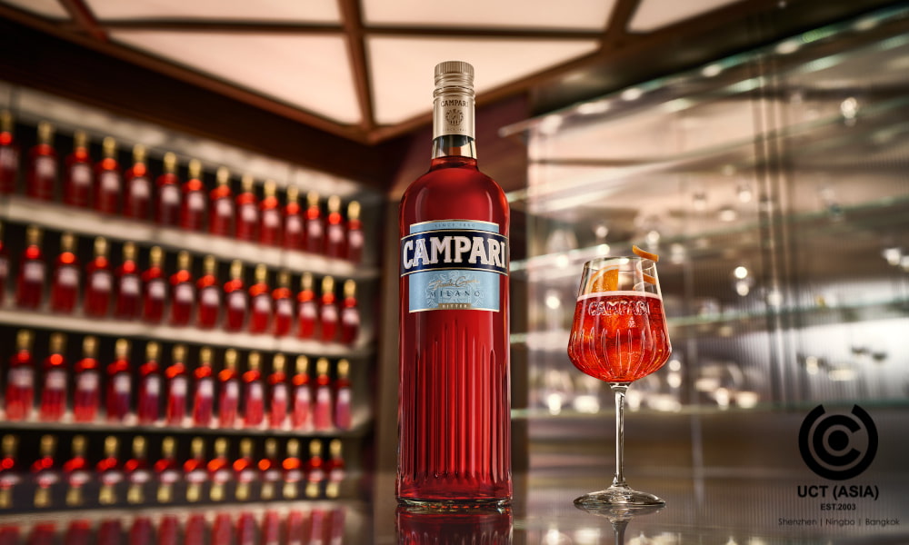
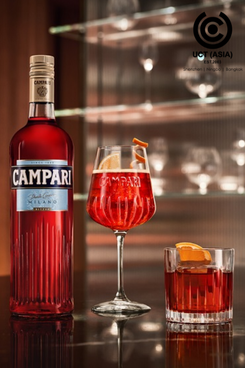
First impressions always matter, and your bottle design is often a consumer’s first introduction to your product. By the way, have you seen the Campari bottle? With the shape, tapered neck, and bold red colour, it’s a design sure to turn heads.
But what’s the story behind the Campari bottle design? And how does it help Campari stay ahead of the market?
More On Campari’s Bottle Design
Campari’s new bottle design celebrates and embodies Milan’s minimalist style and contemporary design. The lines on the bottle symbolize the journey of the Aperitivo ritual from Milan to the world. With an innovative and forward-thinking approach, it represents the city’s vitality and transformation over time.
Furthermore, the brand staged a theatrical drone display to showcase the sleek new bottle design.
How Does This Irresistible Bottle Design Help Campari Stay Ahead of the Market?

Campari’s new bottle design isn’t just a superficial change—it’s a strategic move that positions the brand at the forefront of the market. Here’s a closer look at how this irresistible bottle design propels Campari ahead:
1. Distinctive Brand Identity
The new Campari bottle design is sleek, modern, and minimalist. The design is visually appealing and easily recognisable. It’s also unique and distinctive, which helps Campari to stand out from other liquor brands.
The bottle also has a strong brand identity. The bottle design is consistent with the brand’s overall image and messaging. For example, the bottle’s red colour is a signature element of the Campari brand.
Overall, the new Campari bottle design is an excellent example of how brands can use bottle designs to create an instantly recognisable brand identity.
2. Consumer Engagement
When consumers see a product with a unique and eye-catching design, they’re more likely to be curious about it. They may ask questions about the design or discuss it with others. This curiosity and engagement can lead to increased brand awareness and sales.
This Campari bottle design is an excellent example of this. When our team saw the bottle design, we became curious about it, asking questions such as what inspired it and what it represents. And see? We’re discussing it with you, aren’t we?
3. Innovative Marketing Spectacle
The grand drone show during the launch was a masterstroke in marketing. It not only highlighted the brand’s innovation and technological prowess but also left a lasting imprint on consumers. Innovative marketing strategies like these elevate the brand’s perception, setting Campari apart from its competitors.
4. Versatility
Versatility is important in bottle designs. It allows consumers to use the bottle in a variety of settings. For example, the Campari bottle design is versatile enough to work in various settings. It looks great on a bar shelf, at a party, or even as a decorative item in the house. This makes Campari more likely to be chosen by consumers for different occasions.
In The End,
Campari’s bottle design is a strategic move to secure a competitive edge. It creates a distinctive brand identity, fosters emotional connections, and leverages versatility and innovative marketing. This ensures Campari remains a trailblazer in the industry, captivating consumers worldwide.
How Can UCT (ASIA) Help?
Are you inspired by Campari’s irresistible bottle design? Would you like to revamp your bottle design? If so, let UCT (ASIA) help you develop your brand’s most suitable and effective bottle design.
Connect with us today!

