
You walk into a supermarket, looking to buy a bottle of vodka. You walk to the vodka row and you’re met with a plethora of options, including different brands, and colours. The sheer number of options with their vibrant colours immediately overwhelms you and you’re left picking and dropping.
Now you have to make a decision about which one to choose.
As a liquor brand, how do you make your product stand out? Amid so many other products jostling for the buyer’s attention, how do you set your product apart and get that buyer to choose it even if they don’t know your brand name?
The solution lies in the design of your packaging!
Absolut Vodka Packaging Designs
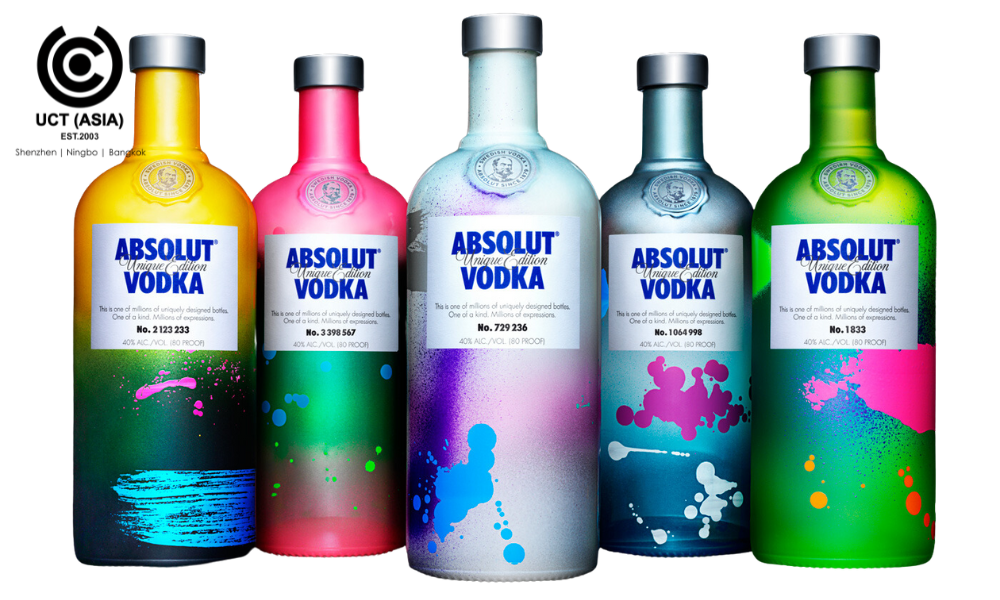
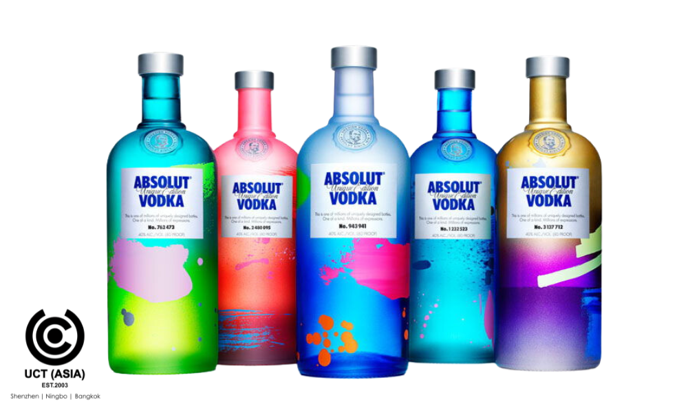
Speaking of packaging designs, our team came across Absolut Vodka, a leading brand of premium vodka that has spearheaded the innovation of vodka packaging for years. The brand runs with a vision to produce four million unique bottle designs, creatively and uniquely exploring colours and every aspect of glass decoration.
5 Ultimate Lesson From Absolut Vodka
As we explored Absolut Vodka’s world of bottle designs, we got inspired to share the lessons we gathered from these award-winning designs. So without further ado, here are 5 ultimate lessons we picked from these impressive designs:
1. Be Simple
From the designs we saw, it was clear that Absolut Vodka believes in simplicity as the ultimate sophistication. From their bottles which radiate elegance through clean lines, minimal elements, and clear communication of the product’s info and brand message, it is clear the brand knows what works and has stuck with it for years.
2. Leverage Collaborations
One significant benefit of collaboration is that it helps bring new ideas and unlock a different level of creativity for your brand. Absolut Vodka’s designs are made possible through collaborations with excellent artists and designers. By collaborating with these creatives, Absolut Vodka can create designs that stand out and set the brand apart in a crowded market.
3. Stay True To Your Brand Identity
It is possible to lose your brand identity in a bid to create the perfect packaging designs. However, that’s not the case with Absolut Vodka. Despite utilising a range of designs, the brand ensured it maintained its identity by aligning its design with its values and essence. Remember, your brand identity ensures that your brand remains consistent and recognised in the minds of consumers.
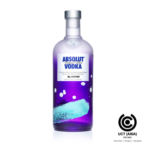
4. Leverage the Power of Colours
Colour plays a major role in marketing. Absolut Vodka masterfully leverages the power of colour psychology in its designs to create emotions that drive sales. Each colour is carefully chosen to spark specific feelings and create memorable experiences.
5. Continuously Evolve
The world and everything in it will continue to evolve, and so should you. We love Absolut Vodka’s commitment to continuously evolve and reinvent itself while staying true to its identity. They make changes where and when necessary and adapt to trends. This is why they remain relevant in the market for years.
In Conclusion
Absolut Vodka’s award-winning designs provide us with incredible lessons to inspire us to a new level of creativity. Remember, great design goes beyond aesthetics; it connects with people and leaves a lasting impression.
Are you ready to revolutionise your packaging game and make an indelible impression? Now is the time to begin! Take the first step now and contact UCT (ASIA) for expert product packaging ideas and designs. Do it now!